Filters

Platform:

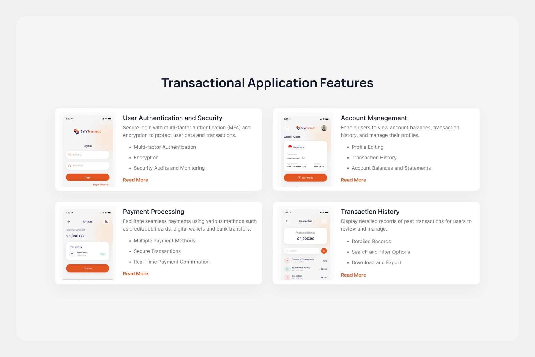
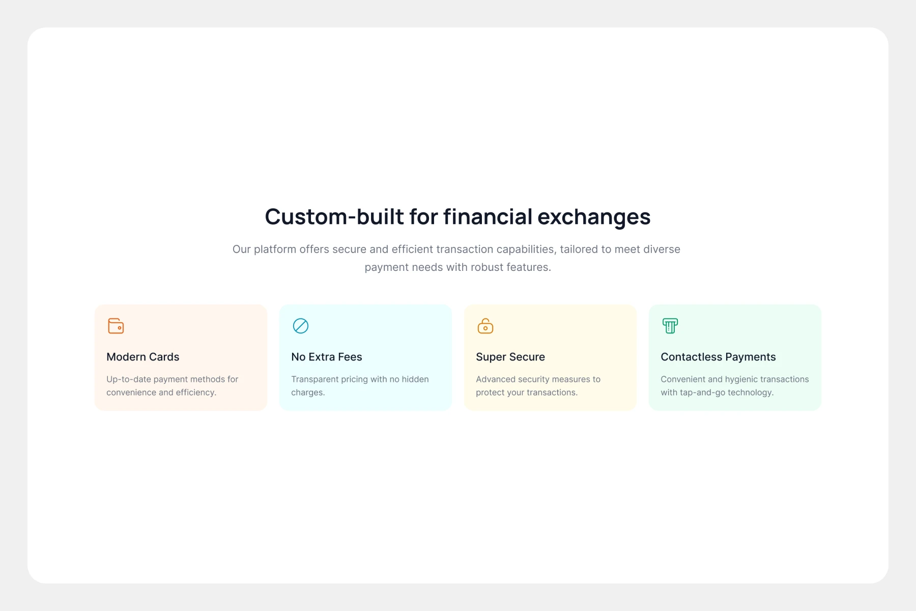
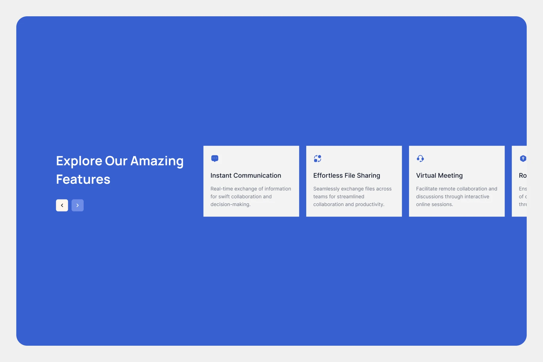
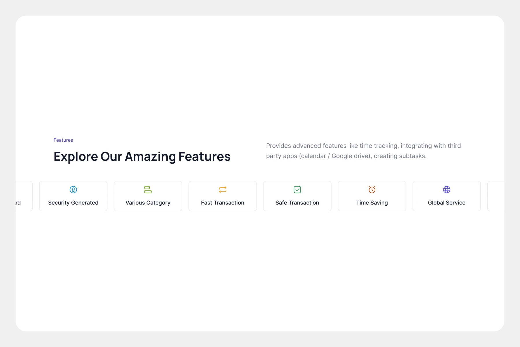
Features Components for Webflow, Framer, and Figma

Highlight the unique features of your product or service with our vibrant feature components for Webflow, Framer, and Figma. Choose from various styles and customization options to create engaging sections that showcase your offerings.

Side By Side Cards Feature Section

Centered headline and supporting subtext, two large rounded pastel feature cards side-by-side, each with minimalist icon, bold title, brief description, and rounded "Read More" button; clean, approachable feature comparison layout..

Two Row Grid Feature Section

Centered headline and subtitle, two-row grid of rounded feature cards with minimalist icons, left-aligned description text below, rounded green "Get Started" button; clean, neutral business feature layout..

Welcoming Layout Feature Section

Left large yellow card with bold headline, subtext, rounded blue "Contact us" button; right 2x2 grid of light blue icons and concise feature descriptions, bright, welcoming layout for benefits and feature highlights..

Geometric Icons Feature Section

Two-by-two grid layout, dark background, minimalist geometric icons atop each card, white feature titles, brief supporting text, discrete "Read more" links; sleek, modern privacy and service feature showcase..

Slider Navigation Feature Section

Centered bold headline and subtext, four rounded feature cards in a row, left card in blue gradient with slider navigation, other cards with minimalist icons and titles; clean customer-focused feature showcase layout..

Minimalist Icons Feature Section

Centered bold headline and subtext, two-row grid of six clean feature blocks, each with colored minimalist icon, feature title, and user focused description; spacious, modern user centric feature layout..

Grid View Cards Feature Section

Centered bold headline and supporting text, two-row grid of six rounded feature cards with icons, active card highlighted in blue center, clean and modern money transfer features layout..

Cards with Icons Feature Section

Left-aligned bold headline and subtext, top-centered dark action button, four horizontally arranged rounded feature cards with icons and brief descriptions; muted gradient background, modern financial product features layout..

Colorful Cards Feature Section

Centered bold headline and subtext, two rounded action buttons, three colorful feature cards with icons and brief titles, clean seamless online functionality layout..

Four Column Feature Section

Centered green "Features" badge, bold headline and supporting text, four-column feature grid with pastel icons and titles, clean minimalist advanced functionality layout..

Component Copied to Clipboard!

Component is ready to be pasted (Ctrl+V) into your project.

Uh-oh, Something’s gone wrong!

Don’t let this bug you Contact Us and we’ll squash it together!

Uh-oh, Something’s gone wrong!

Don’t let this bug you Contact Us and we’ll squash it together!